Ultimate app design guide: tips, principles and trends
If you want your app to be successful, a modern mobile app design that will stand out is an essential step in product development. Check out this guide to stay tuned in app design tendencies in 2022.
Maria Shapovalova
May 31, 2022
11 min read

An app must not be extremely productive or multi-functional. It must not be cross-platform. But it must be visually attractive. You wouldn’t even look at it in the first place if it weren’t.
What is app design?
In a broad sense, application design refers to user interface, user journey, features, and potential use cases. A well-designed app also cannot be exploited or used for any other purpose beside the one it was meant for.
Security and privacy should also be a part of an app design unless it is malware. Needless to say, designing malicious apps is unethical.
In a narrow sense, it refers to user interface and user experience (UI/UX): visual decorative elements and controls, interactive animations, pop-up tips, etc.
It does not mean that app UI only refers to visual appearance. Responsible teams invest a lot of effort into user-friendly interfaces for visually impaired people and those with other disabilities.
Let us first overview the suggestions concerning visual design and the app UX in general.
Mobile app design principles
As one digs deeper into the seemingly simple profession of mobile application design, countless techniques start showing up.
Modern app design considers the latest discoveries of psychology and cognitive science together with empirical data collected from hundreds of apps on tens of thousands of users. The effective practices stay and develop while the others die out in the face of harsh market competition.
Color palette choice for a mobile app
The color palette choice alone is worth a whole book of content. The knowledge of the subtleties of meaning behind every major rainbow color provides a way to hint users about the purpose of design elements or the app as a whole.
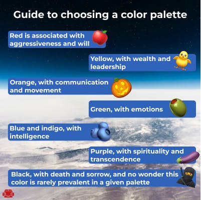
Red is associated with aggressiveness and will;
Yellow, with wealth and leadership;
Orange, with communication and movement;
Green, with emotions;
Blue and indigo, with intelligence;
Purple, with spirituality and transcendence;
Black, with death and sorrow, and no wonder this color is rarely prevalent in a given palette.
Full-color attributions are more extensive and not intuitively obvious, and most users won’t appreciate the subtler references. For example, there is little chance users will attribute yellow to cereals and red to root vegetables in your food app.
If you apply the attributions, users will intuitively grasp the app’s general niche of application looking at its icon for the first time. It applies to the interface elements within the app as well.
Mobile app design software ships with pre-installed color palettes that follow the general color theory. Custom color schemes for your app are easy to find online and add to the preferred visual editor.

UI component hierarchy in mobile app design
Particular spatial arrangement of design elements and their visual representation determines their importance.
Larger elements are definitely important.
Depending on the user locale, they will read a page from left to right or vice versa – consider this when positioning the controls. Left-to-right readers scan pages in Z- or F-patterns.
The overall design should induce the feeling of stability. This is achieved via visual symmetry. The elements are usually arranged in squares, circles, or triangles for that matter.
Make every element familiar. Too much creativity will make users wonder what a given element is every time, leaving them confused and frustrated with an app.
Don’t assume the user's omniscience and leave helpful popup tips close to the control items.
The positioning of items should also be familiar unless you deliberately make an app “stand out” at the cost of user experience. For example, remember how the Close Button has been at the top right corner of a window since forever? That is, until some wonderful person decided to move the window controls to the left in macOS. The users were upset. But the developers deemed it worthwhile to make the experience distinct from Windows OS.
The smaller screens of mobile devices need compact, foldable elements and enough whitespace. Cluttered interfaces overwhelm the user.
App design trends 2022
Global corporations that plan to keep the design for decades currently stick to multiple colors for their logo. Contrasting colors in logos are memorable (TikTok), and it takes skill to combine contrasting colors in such a way that they also harmonize. Google’s logo came in different variants of blue, green, yellow, and red until the agreement concerning their exact RGB codes was reached.
Meta prefers to play with gradients: see their Instagram logo transitioning from golden yellow to violet.
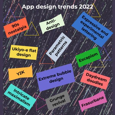
Bright, expressive, futuristic illustrations with dramatic shapes are most popular in 2022. At the same time, minimalistic retro designs also gain traction lately.

As for the non-visual design aspects, gesture and voice processing, face recognition technologies, animations, VR/AR, and various AI/ML implementations are notable mobile app design trends.
How to design an app in 10 steps
The most brief mobile app design guide possible can be compressed into ten list items.
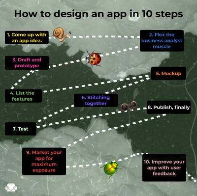
1. Come up with an app idea.
It goes without saying, right? Judging from the frequency of the related Google search queries, developers do not always know exactly what they are going to work on. For that matter, creative blog writers full of inspiration conjure up all kinds of futuristic app design ideas that are doomed to succeed (according to them). It’s up to you whether to pick up those ideas or not.
Creative intuition is not always right. That is why every idea must be tested first among your friends, then among larger audiences, such as reddit users, for example. More advanced market study tools exist, of course, and their use might only be limited by one’s humble budget.
2. Flex the business analyst muscle
Proper market research signifies a professional approach to fail-test certain ideas. It entails the use of social media trend analysis tools – either openly available free ones, or advanced paid ones. Hubspot, Google Trends and Analytics, Amigo, Snaplytics, Keyhole, Curalate, BuzzSumo, and Sprout Social should be mentioned in this regard.
It is true that visionaries are able to detect certain trends before they become mainstream, but the above mentioned tools detect the upcoming trends with more certainty, based on facts.
You might also foreshadow some of the app’s features on social media and forums to start attracting potential users.
3. Draft and prototype
No, not jumping straight into coding or interface design – drafting the custom app design with pen and paper. It includes drafting user workflow and various app windows and casually jotting down some code snippets.
The suggestion to kickstart development with pen & paper sketches is supported by numerous developers who have tried it out. It boosts focus and creativity. Besides, it is easier to outline an app design wireframe when a certain tool does not limit your imagination.
4. List the features
Either before drafting code and design sketches or after, (or in-between), write down the list of your future app’s features. Something to fill the backlog with. Changing it according to the user’s feedback later is fine.
Which features are more important and should occupy the top of the list? Use the 80/20 rule to determine.
5. Mockup
A mockup refers to complete visual design on top of the app’s prototype. Using the drafts made on the previous stages, finish the app’s mockup. It includes fonts, icons, and backgrounds.
The app design mockup tools vary: Figma is a popular solution for web development and Balsamiq is one of the tools for mobile platforms. Depending on your personal preference or the sympathies of your team, any other suitable tool will suffice, including those that are included in development frameworks.
That is a lot of work for a single front end developer. If you work alone, here is a suggestion. Leave the drafts or placeholders in place and hire a graphic or UX/UI designer to work on the release version graphics in parallel.
And tease your target audience with a little something to keep the pot boiling.
6. Stitching together
As soon as all the artwork—or at least the draft version—is in place, finalize the front end part. At this point, the design elements might still be in development. Either a person or a whole department that is in charge of this should decide upon the visual hierarchy. Meanwhile, someone should be working on markup and layouts. In other words, design adaptive or responsive cross-platform interfaces for the app in question.
As a rule, different departments are involved in markup and visual design development: front end (or full stack) developers and UI/UX artists, respectively.
Finally, there is the back end part. Every interactive design element corresponds to its back-end counterpart. Discovering the right proportion of front end and back end developers vs graphic designers is a shared responsibility of Team Leads and Project Managers – unless you work on the app and manage the team alone.
7. Test
This step is the most difficult one because professional development entails tons of testing, especially in the case of cross-platform apps.
If you mean to publish an app exclusively for Android or iOS, the simplest testing method is to install it on your device and click around. Virtual machines are there to automate the testing workflow. But did you write the test cases beforehand or did your QA Team do it for you?
8. Publish, finally
Hopefully, you put aside some extra buck for the publishing fees.
Google Play support representatives report that there is a one-time $25 fee for publishing the first app. Every next one is allegedly free. Verify the fees before publishing and make sure that the app meets the compliance rules for a chosen app store.
App Store publication fee amounts to $99 annually.
9. Market your app for maximum exposure
Marketing should go hand in hand with the development, yet after an app has been published, it goes to another level. Being able to expose your app with web links and QR codes makes marketing a lot more effective.
Naturally, there are dozens of tools meant to measure and optimize performance across different marketing channels.
10. Improve your app with user feedback
User reviews are a goldmine of development directions and should be valued appropriately. Think about the ways to automate feedback collection and escalate user queries to developers when necessary. Disconnection from the users will ruin the long-term success of the app.
That sums up our brief guide on how to design a mobile app top to bottom.

Cross-platform app design tips
Every business must have a website. One step further is a custom mobile application. We specifically focus on mobile application design because statistical trends indicate the rise of popularity in mobile devices: their portability and performance leaves the stationary PCs out of competition for most applications.
Cross-platform approach is favored over native development because of punishing costs of the latter – in terms of money, time, team size, and management effort. Yet, cross-platform development has its implications.
The discrepancy between hardware and OS capabilities of different brands forces developers to balance the reliance on native features with cross-platform consistency. The more complex an app is, the more attention platform differences demand.
Although cross-platform (platform-agnostic) development frameworks help streamline development (via continuous integration / continuous deployment), they introduce inconsistency in system fonts, text alignment, UI controls and icons size and style, shadows, and custom element handling.
Consider Flutter or React Native as the most popular cross-platform app designing programs.
Of course, addressing the inconsistencies will bloat the code base. Nonetheless, it is the only right decision to save holistic design across platforms. The only alternative is to separate iOS app design and Android app design with native frameworks and embrace the aforementioned risks.
For instance, one of the design apps for iPhone is iDesign; Adobe product suite works great for Android. It is considered the best app design software worldwide – and the most expensive, too.
FAQ
How much does it cost to design an app?
The app development costs greatly vary depending on general scale, target platforms, the number and nature of specific features, the ongoing support, any expensive technologies or equipment involved in the development and the like. For example, in the case of a social media app like Facebook the costs could start from $60,000 and exceed millions of dollars.
What is an app UI?
The user interface (UI) refers to all controls and design elements (visual or otherwise) of a given software application.
What is an app UX?
The user experience (UX) stands for the general impression users get from an app. Every design decision contributes to convenience, practical use, or aesthetic feel of a given app, so developers are looking to make the user experience plausible.
What is UI and UX in app development?
The (UI) refers to the design, hierarchy, and positioning of control elements whereas user experience (UX) is the overall impression the app makes on users via the abovementioned design.